Month three: the rotation held
This is the third month of tracking forward returns across two dozen screening strategies. Month one was a momentum blowout: growth and momentum screens led, value lagged, everything finished positive. Month two inverted it: value led, momentum collapsed, and I used the reversal to make the point that one month of returns is mostly noise.
So the interesting question going into month three was simple: does it flip back again? It did not. For the first time, the board mostly repeated the month before rather than reversing it.
How this was measured
Same method throughout. For each strategy I take the basket of tickers it picked on a given past date, enter equal-weight at the first available close after that date, and measure the average percent return to the latest close. These numbers come from picks made on July 3, 2026, measured to August 4, 2026, a fresh one-month window that does not overlap the earlier two. About 22 equal-weighted names per basket. No transaction costs.
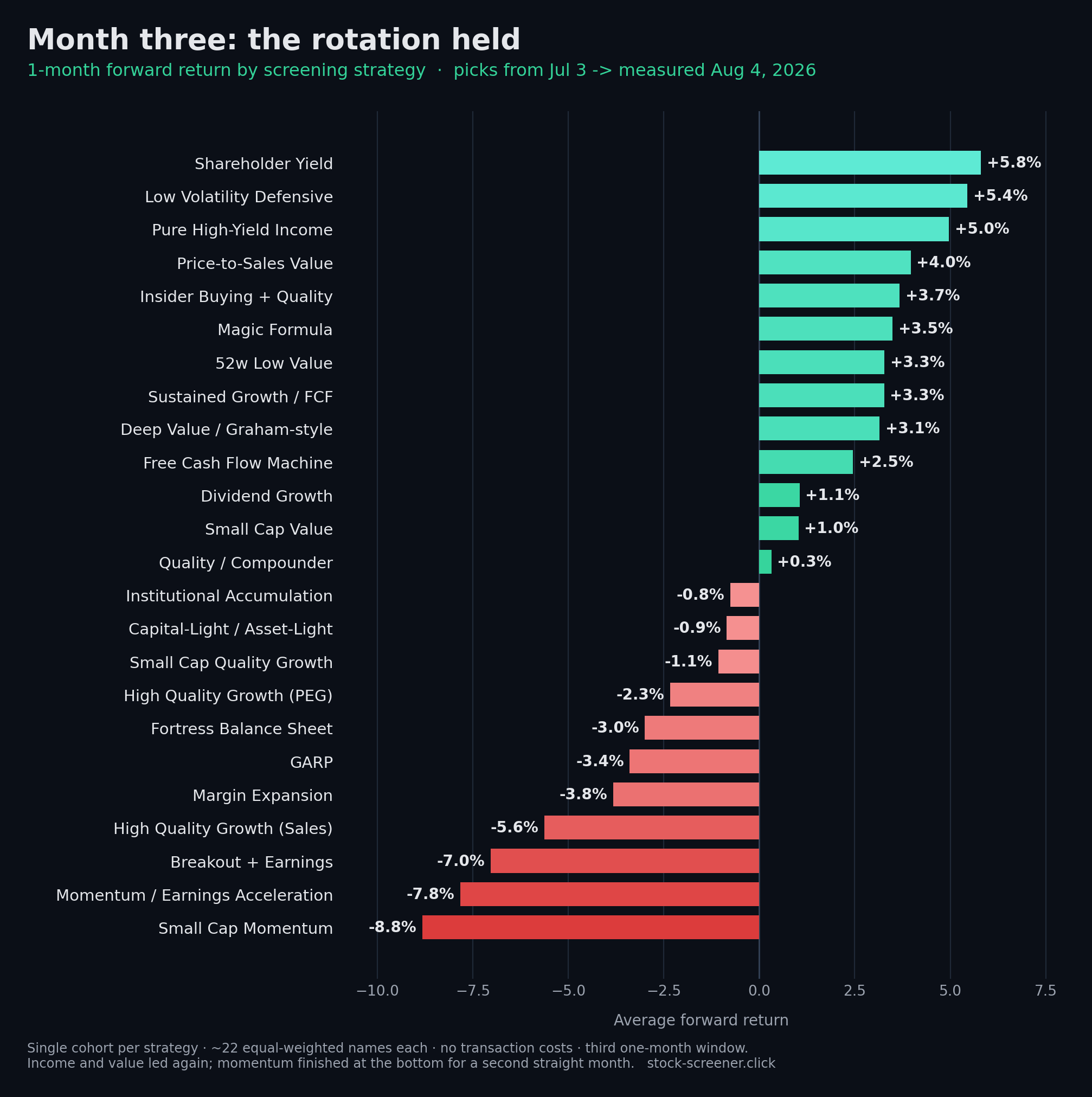
Three months side by side
Sorted by this month's return. The June and May columns are the real results from the previous two posts, so you can trace each strategy across the full run. A few screeners joined the board in June and have no May figure.
| # | Screening strategy | July | June | May |
|---|---|---|---|---|
| 1 | Shareholder Yield | +5.8% | +0.8% | +5.0% |
| 2 | Low Volatility Defensive | +5.4% | -1.4% | +11.6% |
| 3 | Pure High-Yield Income | +5.0% | +0.5% | n/a |
| 4 | Price-to-Sales Value | +4.0% | -0.5% | n/a |
| 5 | Insider Buying + Quality | +3.7% | +4.4% | +8.5% |
| 6 | Magic Formula | +3.5% | +1.9% | n/a |
| 7 | 52w Low Value | +3.3% | +3.6% | +3.0% |
| 8 | Sustained Growth / FCF | +3.3% | +0.2% | +6.9% |
| 9 | Deep Value / Graham-style | +3.1% | +4.5% | +0.9% |
| 10 | Free Cash Flow Machine | +2.5% | -4.4% | +9.2% |
| 11 | Dividend Growth | +1.1% | -2.0% | +4.8% |
| 12 | Small Cap Value | +1.0% | +3.8% | +2.1% |
| 13 | Quality / Compounder | +0.3% | +0.0% | +13.7% |
| 14 | Institutional Accumulation | -0.8% | +5.3% | n/a |
| 15 | Capital-Light / Asset-Light | -0.9% | -2.2% | +12.3% |
| 16 | Small Cap Quality Growth | -1.1% | +5.9% | n/a |
| 17 | High Quality Growth (PEG) | -2.3% | -1.5% | +11.3% |
| 18 | Fortress Balance Sheet | -3.0% | -3.5% | +11.8% |
| 19 | GARP | -3.4% | -6.0% | +16.5% |
| 20 | Margin Expansion | -3.8% | -5.7% | +11.4% |
| 21 | High Quality Growth (Sales) | -5.6% | -0.7% | +12.8% |
| 22 | Breakout + Earnings | -7.0% | -0.5% | +10.0% |
| 23 | Momentum / Earnings Acceleration | -7.8% | -7.6% | +18.1% |
| 24 | Small Cap Momentum | -8.8% | -13.2% | +12.4% |
What stood out
- Momentum stayed in the penalty box. For a second straight month the momentum and high-growth screens filled the bottom of the table: Small Cap Momentum (-8.8%), Momentum / Earnings Acceleration (-7.8%) and Breakout + Earnings (-7.0%). After topping the board in May, momentum has now been the worst place to be two months running.
- Leadership turned defensive. June's rebound was led by deep value; July's was led by income and stability. Shareholder Yield (+5.8%), Low Volatility Defensive (+5.4%) and Pure High-Yield Income (+5.0%) took the top three. Investors were paying up for yield and low beta, not just cheapness, a more risk-off posture than the month before.
- A consistency group is emerging. Six screens have now been positive in all three months: Shareholder Yield, 52-week-low Value, Insider Buying + Quality, Deep Value, Small Cap Value and Sustained Growth / FCF. Every one of them is a value, income or quality screen. Not a single momentum strategy can say the same.
What's next
With three months logged, I can finally do the thing this series was building toward: a cumulative view. Instead of a fresh single-month snapshot each time, the next piece will compound each strategy's baskets across every pick date, so "who is actually consistent" becomes a line on a chart rather than a hunch. I'm also still planning to test whether consensus picks, the tickers several independent strategies flag at once, hold up better than any single screener has.
Want the data behind this?
Daily picks, consensus signals, and cohort-based performance, all as a simple JSON API, with a free tier.
Get it on RapidAPI →